

RATIONALE
Street Art Mag “MURAL”
The primary objective of “MURAL” magazine is to showcase the creativity, diversity, and beauty of urban contemporary art locally and around the world.
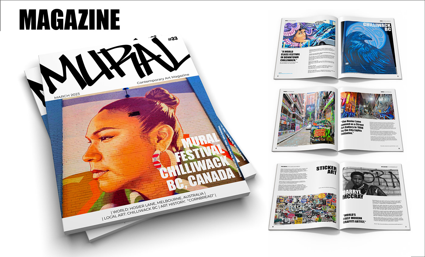
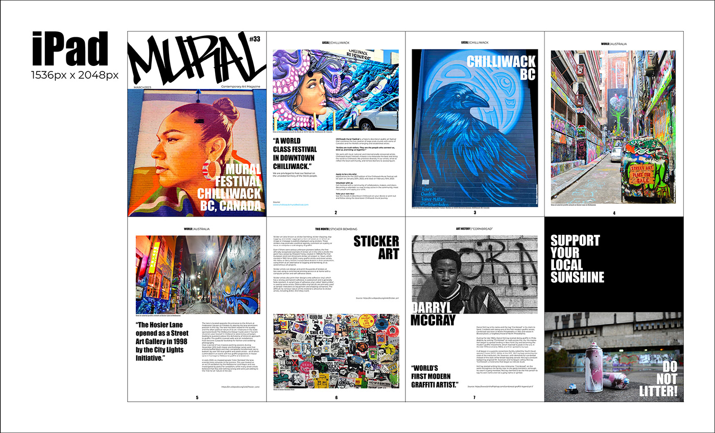
Firstly, the magazine’s cover is eye-catching and bold, featuring a high-quality image of graffiti representing the current issue’s theme or local event.
Inside the magazine, the design incorporates a mix of full-page photographs, text, and graphics, capturing the essence of street art.
The layout is clean and easy to navigate, with a consistent design style throughout the pages.
To enhance the reading experience, the magazine features interviews with prominent urban artists, reviews of mural art exhibitions and festivals, analysis of street art’s history, social, cultural, and political significance, and behind-the-scenes glimpses of the creation process.
The design supports these features by using a balanced mix of text and images, focusing on high-quality, full-page/half-page photographs that showcase the details of each artwork.
Overall, the design of “MURAL” captures the unique essence of this art form and inspires readers to appreciate the beauty of street art, by incorporating bold imagery of vibrant colours and a balanced mix of text and graphics.
MOOD BOARD

COLOUR
This achromatic colour scheme help as a neutral base to create contrast between the background and the images, allowing the artwork to stand out on the page.
Black and white create an edgy and raw aesthetic, which vibe with the urban art scene, conveying a sense of the authentic and rebellious street art culture.
Additionally, black and white helps create a sense of timelessness and universality. Overall, black and white in the design of this magazine helps create an authentic look that showcases the art in the best possible way.

TYPEFACE
Mural magazine aims to capture the raw energy and bold aesthetics of the urban art scene while maintaining a modern and professional visual identity.
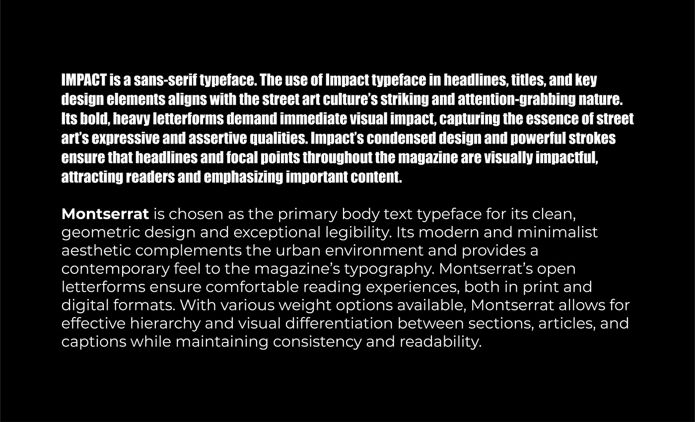
The combination of Impact and Montserrat typefaces creates a harmonious and cohesive typographic system for this street art magazine.
Impact’s strong presence in headlines creates a bold and captivating entry point. On the other hand, Montserrat establishes a clean and modern foundation for the body text, providing readability and a sense of professionalism throughout the magazine’s articles and descriptions.
Utilizing these two typefaces create a balance between street art’s dynamic and expressive nature while maintaining a contemporary and approachable design aesthetic. This typographic choice ensures that the magazine’s content is accessible, visually stimulating, and effectively communicates the vibrant energy and creativity of the street art world to our readers.
MASTHEAD

SUBWAY NEW YORK SC typeface has a tag style representing the Graffiti Culture in Metropolitan areas. It is the masthead of the magazine because of its boldness and freestyle.

THE MAGAZINE


Made with ♥ by Indira Castellanos | Ototoi Design Lab

